
Ed note: Earlier this week I started updating our new app Merchbar (more on that soon) to iPhone 6 and 6+, along the way I found a few unanticipated tweaks. I hope you find them helpful. This was originally an email posted to our team.
Background – From iPhone 3 to iPhone 4 to iPhone 5
When we moved from the iPhone 3 to iPhone 4 the screen effectively doubled in resolution but stayed the same in size.
Said another way, the canvas of 320×480 stayed the same and assets just had to be upgraded to double the resolution (640×960). The layout stayed exactly the same.
When the iPhone 5 came out, the screen was lengthened so the canvas only expanded in one direction – vertically to 568. This was pretty easy because many assets (tab bars, status bars and banners) that we custom created were top and bottom aligned. Things stayed almost exactly the same, there was now just room for extra content in the middle.
With the launch of the new iPhone 6 and iPhone6+, it is an entirely different beast than the previous upgrades. While the 6+ does introduce a new resolution, it also introduces a new layout. For this upgrade it isn’t an issue of upsizing assets but both upsizing and relaying out the interface… twice.

The Details – Bigger Canvas, Bigger Assets
The iPhone 6 stays at @2x resolution but the canvas changes to 375×667. This means that your status bars need to still be 20 points (40 pixels) but now instead of 320 points (640 pixels) wide they need to be 375points (750).
So no assets actually get made proportionally larger, they need to be recreated or resized for a different size canvas.
For the iPhone 6+ this issue is now doubled. Not only is the canvas larger, 414×736 points (1242×2208 pixels) but now the images are at 3x. (And lets set aside the whole downsampling aspect for a moment.)
So to move from iPhone 5 to 6+ the canvas needs to be expanded and then everything needs to a new higher resolution image.
Lets go back to the status bar we just made from 20x320points (iPhone 5) to 20×375 (iPhone 6). Now it needs to be expanded again to be 20x414points (iPhone6+). And when we dive into pixels we have to go from 40×640 (iPhone5) to 40×750 (iPhone6) to 60×1242 (iPhone6+).
Here an example of how our custom status bars look look in their three band-spanking new resolutions (I know, I know, they aren’t pixel perfect… yet!):
iPhone4 and iPhone5 (40×640)

iPhone 6 (40×750)

iPhone6+ (60×1242)

So as we update for iPhone 6 and 6+ this will be handy to keep in mind. The good news is that from looking at our current images we have actually done a pretty good job of setting things up in a way that will allow us to make this change without it being the end of the world.
So how do we make the changes?
This overview from PaintCode is super helpful in understanding the raw screensize changes but it doesn’t get into the issues around layout.

I do all my designing in Photoshop so here’s my workflow (though same concept will work well elsewhere).
The easiest way to make the change is to start with your iPhone 4 (or 5) layout and assets and expand the canvas to the iPhone 6 actual resolution (750×1334). From there, navigational elements, buttons, etc should all stay the same size, but will need to be relayed out to fit the new canvas.
Larger elements, backgrounds, anything full width or full height will need to be recreated/rebuilt/upscaled.
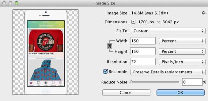
Once I completed that I changed the entire image size from @2x to @3x.
This is when you pat yourself on the back for doing everything as smart objects when you weren’t really sure why you were going to all the trouble.
But you aren’t done!
Now you need to expand the canvas to the new iPhone 6+ size. If you did it right, your iPhone 6 @2x screen should be 750×1334 and when you sampled it up to @3x it should be 1125×2001. Now expand the canvas to 1242×2208.
Only now can you relayout all of your newly @3x assets in the new space.
I summarized the process in this tweet:
And there you go!
Final Thoughts
Sometimes the best and/or easiest way is to just do one off asset updates. For those, I made myself a quick spreadsheet to do the math between @1x, @2x, @3x. You can view/copy/use it here.
I’m super interested to see how the downsampling in the iPhone 6+ works. If you’ve seen it, hit us with a comment of your thoughts, ideas and take.
—
My new company Merchbar launches on Tuesday! Sign up for our mailing list here or follow us on Twitter.
We are hiring designers, engineers and growth hackers. Tweet at me @aten, I’d love to meet you.
 Edward Aten - Let's push things forward.